Sempre - Viva

Sempre-Viva is a cosmetics brand that combines natural ingredients and aromatherapy to create products focused on well-being and personal care.
The challenge was to develop concepts and packaging for a new product line — including solid shampoos, conditioners, hair creams, and shaving creams.

Inspired by Art Nouveau and by packaging from the late 19th and early 20th centuries, the visual identity evokes an elegant and timeless style. Product differentiation was achieved through a distinct color palette, while the men’s line incorporated unique illustrations and textures, creating stronger identification with its target audience while preserving the brand’s unifying essence.

The Foundation: Anatomy of the Golden Ratio

The Concept: Beauty, Wellness, and Purpose

The design was driven by a clear intent: to encapsulate the refreshing sensation of a bath, combined with the wellness and relaxation provided by natural aromas.

We sought an aesthetic that transcended the usual. The visual concept delves into Art Nouveau to bring forth an ethereal and divine beauty, evoking something spiritual and timeless.

The Structure of Distinction

To ensure the packaging was a point of impact and stood out at the point of sale, we required an impeccable foundation.

The Golden Ratio () was our tool for this. It ensured:

  • Form Structure (Estrutura da Forma): The rigorous application of the Golden Ratio brought inherent beauty and balance to the composition of the initial sketch.

  • Visual Impact (Impacto Visual): The mathematical harmony makes the design naturally appealing to the eye, successfully capturing consumer attention.

  • Emotional Connection (Conexão Emocional): The intention is for the visual concept to directly convey the wellness experience promised by the product, elevating the packaging to a desirable item.

Visual Concept: The New Masculine Ritual

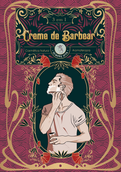
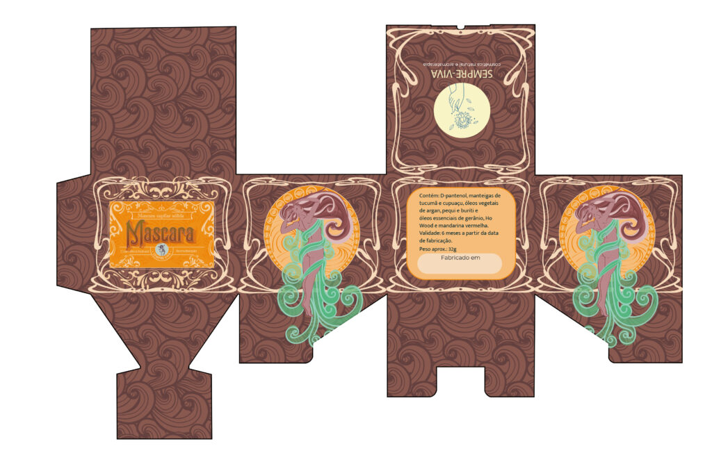
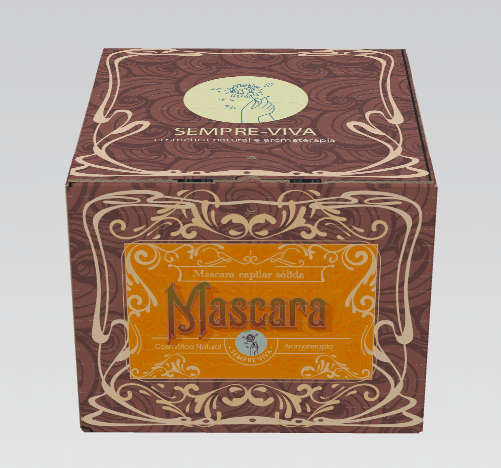
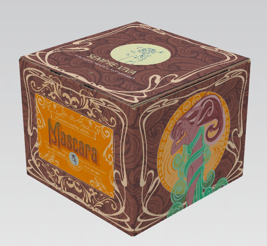
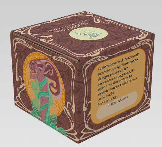
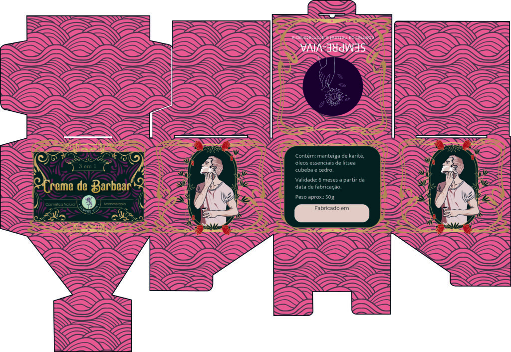
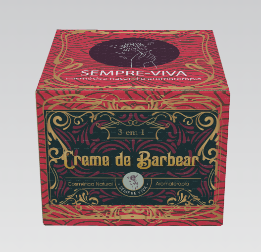
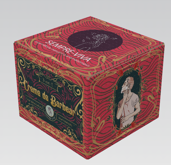
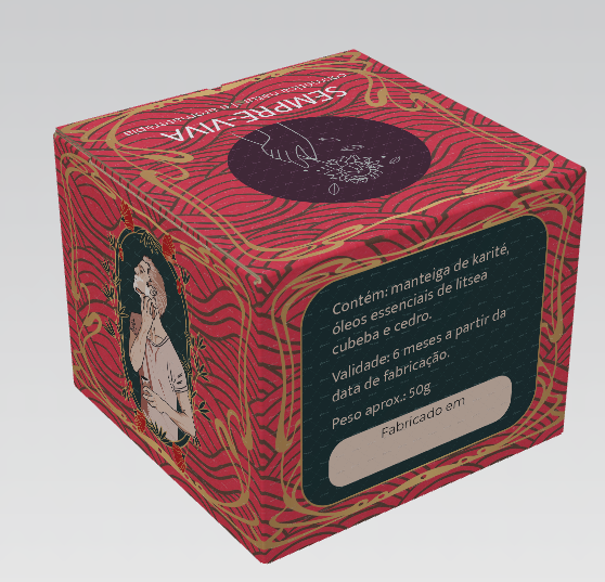
The visual development for the shaving cream focused on one core psychological premise: ensuring men feel masculine and confident when using a personal care product.

To achieve this, we established a strategic contrast by reaffirming Authentic Masculinity.

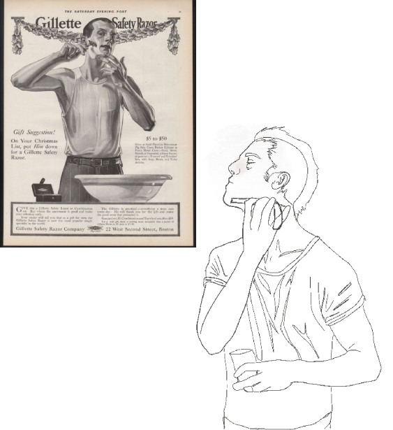
The identity revives the Authentic Masculinity found in classic, vintage shaving advertisements. The traditional ritual (the straight razor, the seriousness of the shave) serves as an emotional validation:

  • Consumption Validation: The visual reassures the consumer that purchasing the product is an act of strong self-care, not a softening of his image.

  • Tradition and Trust: The visual heritage communicates trust and the quality of a time-tested ritual.

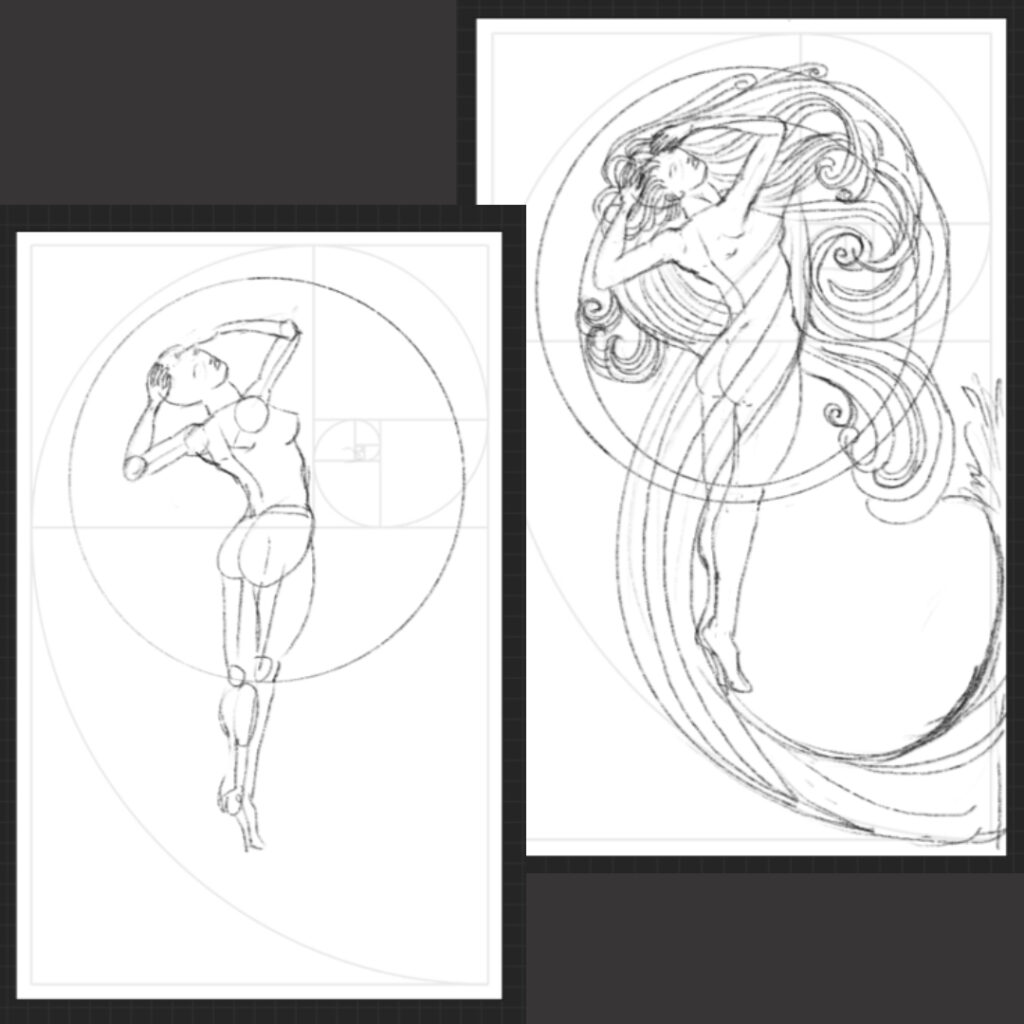
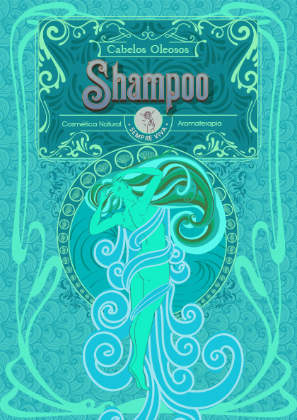
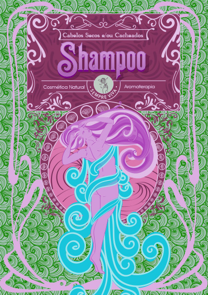
This traditional foundation was then refined with the contemporary male beauty aesthetic. The illustration style updates the figure, showcasing a man who values personal care without sacrificing his strength and style. The design successfully unites respect for tradition with the aesthetic standards of the modern man.

The result is a strong, relevant, and intentional visual identity, appealing to an audience that seeks quality and reaffirmation in their grooming rituals.

Defining the Packaging Personality

Following the structural foundation of the Golden Ratio, these concept boards translated the ethereal Art Nouveau concept into a definitive visual language.

These concept boards established a strategic color-coding system where each color combination does more than differentiate the product—it immediately communicates the functional benefit and emotional promise:

  • Blues and Lilacs convey hydration and softness (Conditioner).

  • Green-Tones and Cyan symbolize intense freshness and detoxification (Oily Hair Shampoo).

  • Purples and Turquoise suggest balance and strengthening (Normal Hair and/or Hair Loss Shampoo).

  • Warm Oranges and Deep Burgundies suggest richness, concentrated nutrition, and premium treatment (Masks).

  • The Deep Burgundy and Gold combination is reserved for the shaving cream, instantly communicating luxury, tradition, and masculine confidence.

This strategic color palette ensures the entire line maintains aesthetic coherence while clearly signaling the intended wellness experience to the consumer.

Final Visuals and Production Details

The packaging solution was directly influenced by the nature of the products: since no items were liquid (all were solid, shaped like small soaps), we eliminated the use of bottles and opted for boxes.

This decision was transformed into a production differential:

  • Integrated Primary Packaging: The conceptual boards for each product were not discarded. Instead, they were printed onto a specialized paper. This paper was used to directly wrap each solid product.

  • Functionality and Information: The reverse side of each wrap (the primary packaging) was printed with usage specifications and the ingredient list, formatted like a medicine leaflet (product insert).

This approach ensures a minimalist packaging, significantly reducing waste, where the visual identity and technical information are delivered in a single, elegant, and functional piece.

Shampoo for Oily Hair

Shampoo for Normal Hair

Shampoo for Dry or Curly Hair

Conditioner

Hair Mask

Shaving Cream

Results

The redesign positioned Sempre-Viva as a premium natural cosmetics brand with a stronger shelf presence and emotional appeal.

Highlights:

  • +37% increase in sales within six months.

  • +45% growth in brand awareness among target consumers.

  • 25% reduction in material waste from optimized packaging.

  • Enhanced shelf visibility and improved placement in retail stores.

Beyond numbers, the new identity built a unified design system — consistent, scalable, and aligned with the brand’s renewed purpose.

Rolar para cima