Primavera
Primavera — A New Chapter for a Beloved Classic
Rebranding a well-known product is often more challenging than creating one from scratch — especially when it already lives in people’s collective memory. The Primavera project was born with this mission: to transform the perception of a brand known for its low price into a symbol of accessible quality and renewal.
With the new formula raising the product’s standard, the visual identity needed to reflect this evolution. The challenge was to modernize without losing familiarity, redesigning the iconic mascot, revitalizing the logo, and creating packaging that communicates softness, freshness, and trust — the core attributes of the brand’s new phase.
The new visual system repositions Primavera as a smart, value-driven choice — maintaining its popular essence while expressing genuine quality through thoughtful design.
In essence, this project marks the rebirth of a classic: a product that has evolved without losing its soul — familiar, approachable, and better than ever.
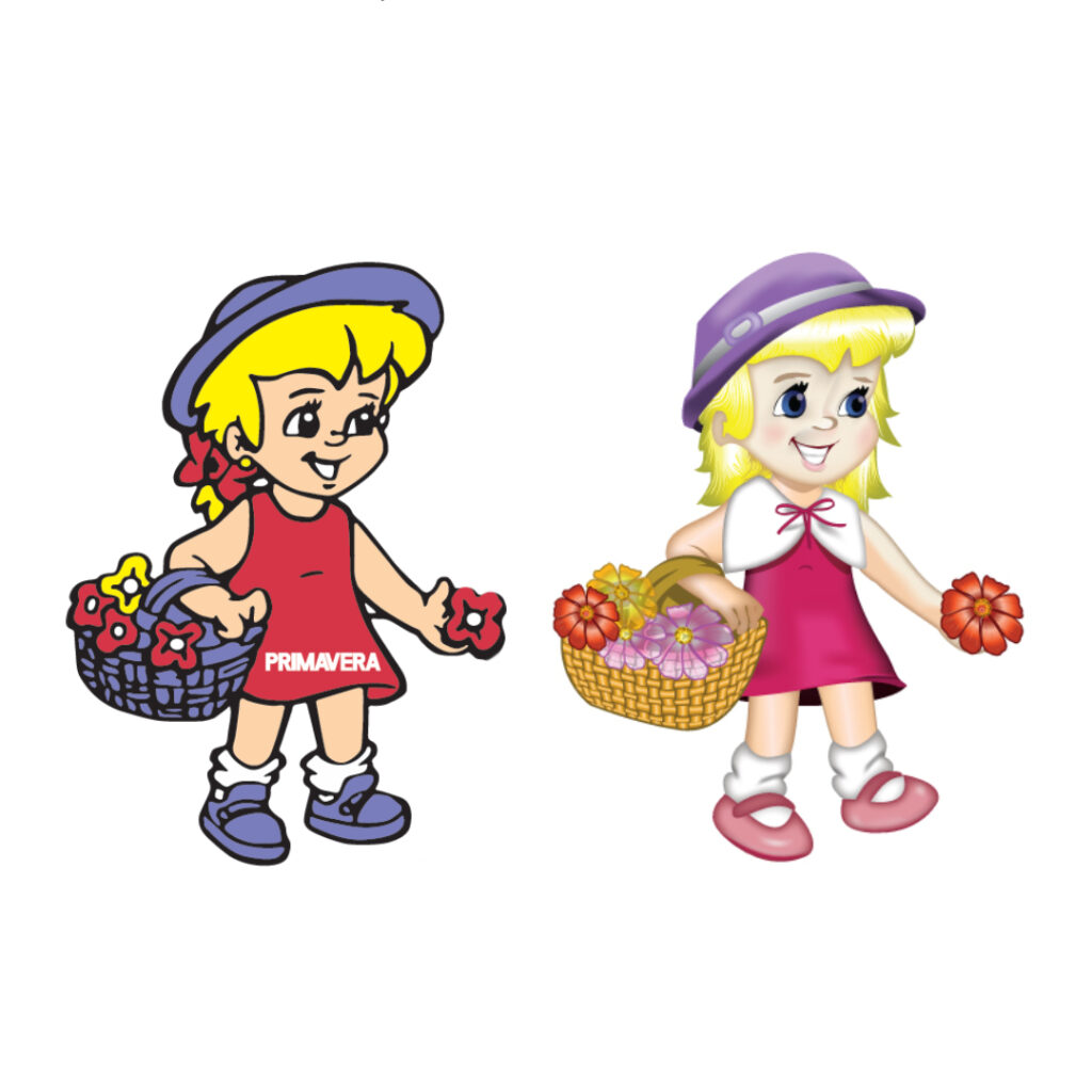
Primavera Mascot — Emotional Redesign and Brand Renewal
The new Primavera mascot marks the transition from a nostalgic visual identity to a more human and emotional representation of the brand. The redesign modernizes the character without breaking from its original essence, updating shapes, colors, and expressions to reflect the company’s new values — care, delicacy, and authenticity.
The forms are now soft and three-dimensional, replacing the rigid outlines with light and volume, conveying harmony and approachability. The face gained warmth and empathy, with bright eyes and a natural smile that connect emotionally with the audience through emotional design principles.
The color palette also evolved: blue gave way to shades of lilac, pink, and white — colors associated with purity and sophistication. These chromatic adjustments reposition the brand on a more refined and contemporary level, expanding its appeal to a broader audience.
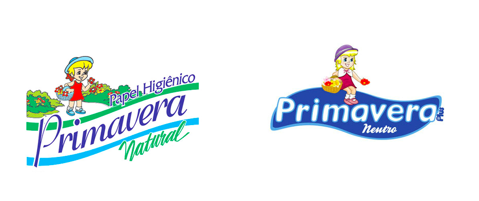
Primavera Logo — Redesign and Emotional Repositioning
The Primavera logo redesign aimed to align the brand’s visual identity with its new positioning — a product that evolved in quality and needed to express this transformation through form, color, and emotion.
The new typography replaces rigid lines with soft curves and subtle volume, conveying softness, comfort, and care — essential attributes of a premium toilet paper. The integration between the logotype and mascot creates a cohesive visual system, where, according to Gestalt principles, proximity reinforces unity and memorability.
The color palette, dominated by white and lilac, communicates cleanliness and sophistication while preserving emotional ties to the previous identity through floral details and soft pink accents.
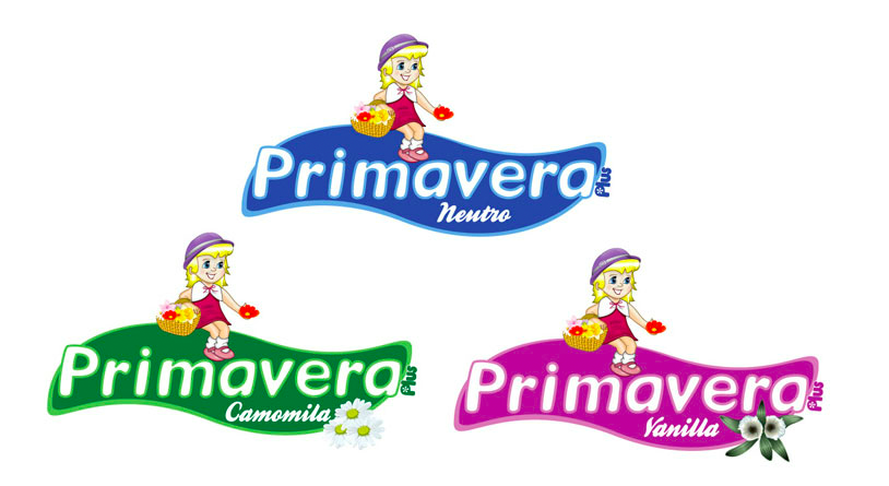
The Primavera line was organized into three versions — Neutral, Chamomile, and Vanilla — each featuring distinct visual elements, such as illustrated paper rolls and flowers. The highlight is the Vanilla version, which adopts pink instead of the traditional beige, referencing the brand’s nostalgic color while emphasizing that the paper is now white and of higher quality.
In essence, the new logo and its variations represent the complete evolution of Primavera: a brand that preserves its popular roots but now communicates softness, quality, and emotional sophistication through contemporary, sensory design.
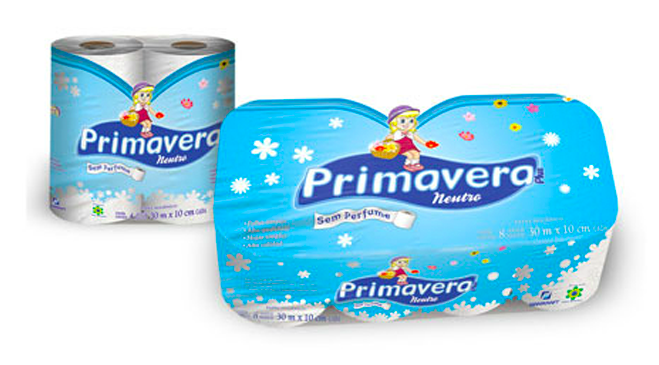
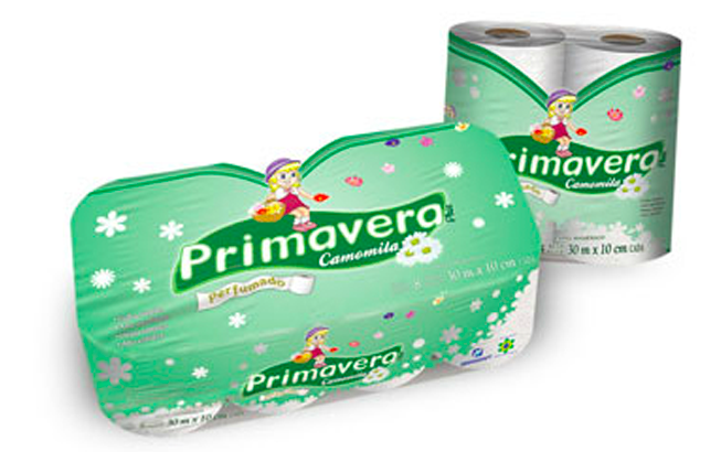
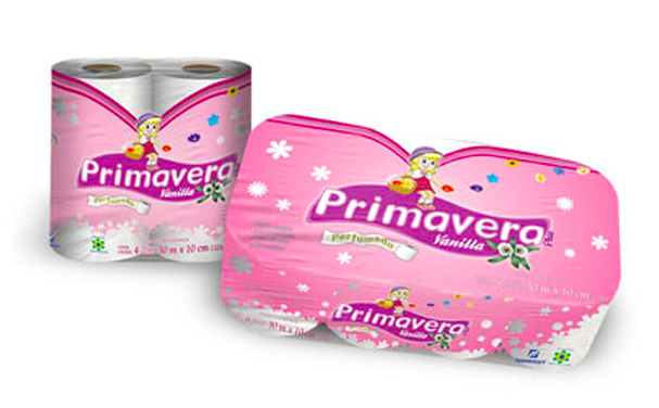
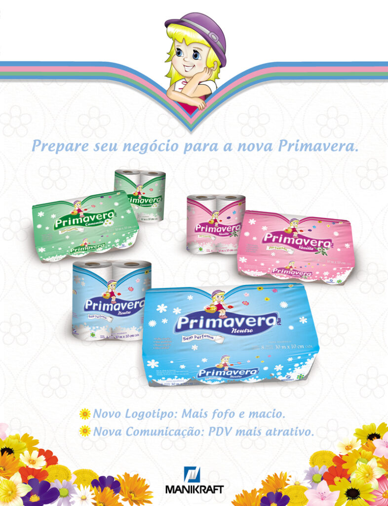
Primavera Packaging — Emotional Design and Brand Clarity
The new Primavera packaging line was created to visually and emotionally express the product’s evolution and the brand’s new positioning. The redesign balances emotion, function, and perceived quality, translating the softness and care of the paper into a coherent and engaging visual language.
The unified structure — with a centralized logo, integrated mascot, and translucent floral backgrounds — establishes a cohesive visual system that enhances shelf recognition and reinforces brand familiarity. Meanwhile, the distinct color palette for each variant (Blue for Neutral, Green for Chamomile, and Pink for Vanilla) communicates specific attributes while maintaining visual and emotional harmony.
The use of transparency was a strategic decision: allowing consumers to see the white paper reinforces credibility and trust, replacing verbal claims with visual proof. Floral elements, soft typography, and delicate textures enhance the sensation of softness and comfort — transforming the act of purchase into an emotional experience.
In essence, the new Primavera packaging repositions the brand as an icon of care, lightness, and authenticity, elevating a traditional product to a higher level of perceived value while preserving its popular and emotional essence.
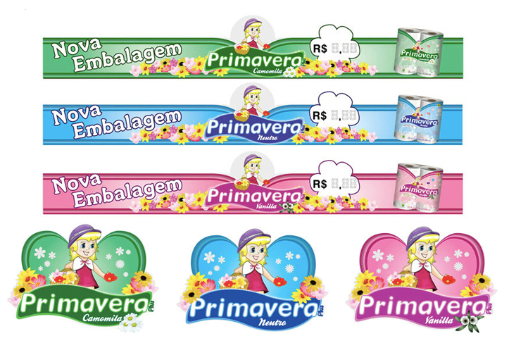
POS Materials and Sales Sheet — Primavera
The new Primavera point-of-sale materials were designed to communicate the brand’s renewal clearly and emotionally. More than announcing a “new packaging,” the project was conceived to attract, recognize, and convert — the three essential pillars of strategic trade marketing design.
The Primavera Girl mascot at the top of each piece ensures instant empathy and emotional recognition, while the variant colors (green, blue, and pink) maintain visual consistency across the line and make identification easier from a distance. The organic shapes, soft curves, and floral backgrounds visually translate the product’s attributes — softness, lightness, and care — creating an atmosphere of delicacy and comfort at the point of sale.
The sales sheet aimed at retailers adopts a clear and visually balanced communication style, highlighting the main improvements of the redesign: a softer, friendlier logo and a more attractive POS presence. This straightforward approach turns the piece into an effective commercial tool, simplifying presentation and enhancing the perceived value of the product on the shelf.
The results validated the strategy: Primavera, once a leading brand with low recall, regained market relevance after the redesign. The brand exceeded its sales goals and, in several Brazilian states, ranked among the best-selling toilet paper brands in its category — clear proof of consumer approval and the success of the new visual identity.
Together, these materials strengthen the brand’s retail presence and solidify Primavera’s emotional repositioning — a traditional brand reinvented with sensitivity, without losing its popular and heartfelt essence.