Mamãe Vigorosa
Turning Authority into Conversion: The Birth of the Mamãe Vigorosa Brand
Personal trainer Aline Bouto had a clear mission: to help mothers regain their physical strength and self-esteem after childbirth through a safe and effective method. That’s how Mamãe Vigorosa was born — a 12-week online program focused on conditioning, muscle strengthening, and diastasis recti recovery using hypopressive exercises.
My role was to transform this expertise into a brand with soul and conversion power. I designed Aline’s personal logo, built the entire visual identity for the digital product, and developed a high-converting landing page. I also crafted the digital marketing strategy, wrote tested copy for ads and the LP, and implemented full KPI tracking and campaign analysis.
The result? A cohesive, professional brand with a strategic digital presence — ready to scale both impact and results in the women’s health and wellness market.

Aline Bouto – Personal Trainer
A visual identity that embodies strength with empathy
The Aline Bouto logo was born from the fusion of energy, purpose, and movement.
Created for a personal trainer specialized in female performance and wellness, the symbol reflects the balance between strength and sensitivity, expressing the archetype of the transformational guide — someone who inspires confidence and leads others toward growth.
Its fluid shapes evoke the body in motion, while the clean, modern typography conveys professionalism and authority. The vibrant color palette reinforces vitality and motivation, making the brand both memorable and emotionally engaging.
More than a visual identifier, this logo is a symbolic expression of the self-transformation journey that Aline promotes for her clients — an emblem of progress, balance, and empowerment.

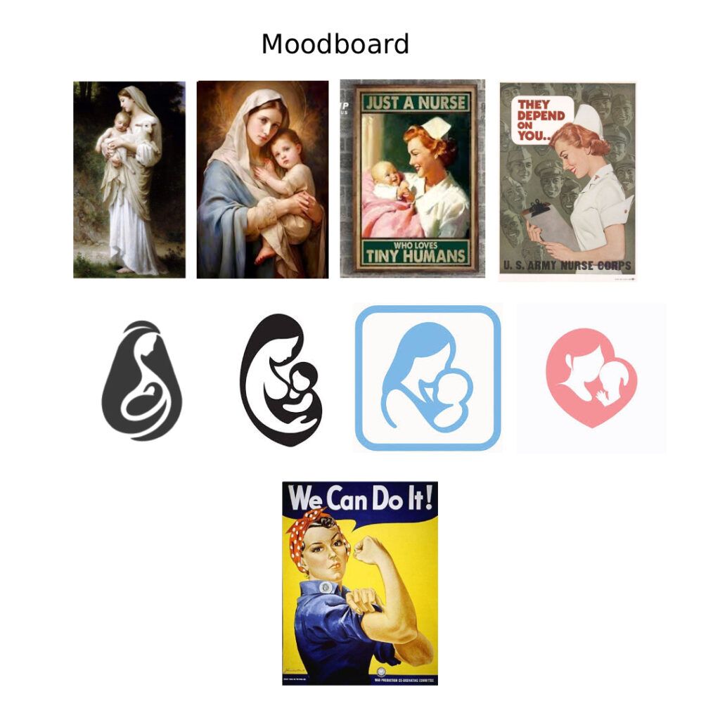
Mamãe Vigorosa — Conceptual Moodboard
The strength and tenderness that coexist within every mother
The Mamãe Vigorosa moodboard was born from the fusion of two emotional forces: the gentleness of maternal care and the energy of feminine determination.
On one side, the sacred symbolism of motherhood — inspired by images such as the Virgin Mary and mothers in nurturing gestures — represents the Caregiver archetype: love, warmth, and human connection.
On the other, the iconic Rosie the Riveter embodies the Heroine spirit — courage, vitality, and self-assurance in motion.
This visual and emotional duality gives rise to an identity that celebrates the contemporary mother: strong, confident, and compassionate.
More than a collection of references, the moodboard stands as a visual manifesto — inspiring women to rediscover their own strength through care and courage.

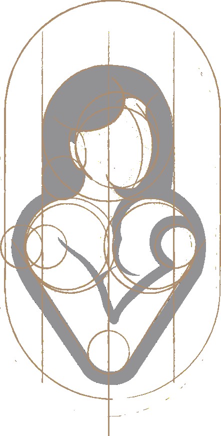
Symbol — Mamãe Vigorosa
The synthesis of love, strength, and vitality
The Mamãe Vigorosa symbol was designed to portray a new vision of motherhood — active, confident, and whole.
The mother’s raised head, built from two overlapping circles, breaks away from the classical image of passive protection, embodying serenity, confidence, and self-awareness.
Her body, shaped by inverted “V” curves, directly references the word Vigorosa and conveys the balance between care and strength.
Every line was crafted to express the brand’s purpose: to unite love, energy, and self-care in a single harmonious form.
The result is a minimalist, symbolic icon that celebrates the contemporary mother — one who loves, nurtures, and lifts her gaze toward the world.

Logo — Mamãe Vigorosa
The gentle strength of motherhood
The Mamãe Vigorosa logo emerges as a natural extension of the Aline Bouto brand, preserving its visual DNA while introducing a new dimension — motherhood as a source of strength and serenity.
The symbol — a mother holding her baby — expresses connection and vitality through harmonious curves and a solid “V” structure, a direct reference to the word Vigorosa.
The gray and soft pink palette balances rationality and warmth, while the modern typography conveys approachability and confidence.
Both horizontal and vertical versions ensure versatility and consistency across applications, maintaining clarity, balance, and presence in every format.
More than a logo, it is the visual expression of a simple yet powerful idea:
to be a mother is to be vigorous — strong, serene, and constantly growing.

Landing Page — Mamãe Vigorosa Program
A digital experience designed to inspire action and belonging
This landing page is one of the versions developed as part of the comprehensive launch strategy for the Mamãe Vigorosa program — created to position Aline Bouto’s method in the digital space with clarity, emotion, and purpose.
The project was guided by principles of UX and perception psychology, blending emotional design with functional architecture. Information was strategically distributed throughout the page to guide the user’s emotional journey with precision.
Each statement or promise was immediately supported by a testimonial, reinforcing credibility and trust through proof. The offer was intentionally placed at the end of the page, allowing the perceived value of the program to be fully communicated before presenting the price.
Every section was structured based on data collected through performance tracking and user behavior analysis, which I personally implemented and monitored. The result is a digital experience that combines light structure, clear hierarchy, and linear navigation, reducing cognitive friction and enhancing engagement (Hick’s and Jakob’s Laws).
Soft colors, modern typography, and generous white space create a calm digital environment that welcomes users while naturally leading them to action.
More than an aesthetic interface, this page serves as a strategic bridge between brand and audience, turning emotional resonance into measurable results.
Results
The Mamãe Vigorosa launch exceeded expectations, validating the power of strategic design paired with digital performance.
Highlights:
+52% conversion rate on the landing page during the first campaign cycle.
3.4× ROI on paid traffic compared to the client’s previous campaign benchmarks.
+60% increase in qualified leads through refined copy, layout, and visual storytelling.
The new brand identity achieved consistent recognition across social media and ads, strengthening recall and authority in the women’s wellness segment.
More than numbers, the project transformed a personal brand into a scalable business — combining emotional resonance with measurable market impact.